
Thirsty for Strong Instructional Practice?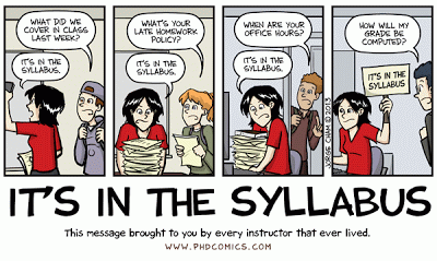
Traditionally syllabi have been brief outlines that listed the scope and sequence of course topics, readings and assignments. Today however, the syllabus has become a quasi-legal contract between a course instructor and the students exacting in grueling detail the rules, regulations, and expectations for class – from policies on laptop use in class to the rules for acceptance of late papers. To the extent that faculty want to use the syllabus-contract to cover every eventuality, many syllabi have grown into 10, 15, even 20-page laundry lists of information required by the university (e.g. ADA accommodations), accrediting agencies (e.g. learning outcomes), departments (e.g. office hours) and even students themselves (detailed assignment rubrics). And while this information is important, the legalistic air of a modern syllabus can make them unwelcoming and intimidating lists of what students can’t do and the penalties for their failure to adhere. And to make matters worse, as David Parry suggests, students treat syllabi more as End User License Agreements (EULAs), skimming the first page or few paragraphs before ‘clicking’ “agree to terms” and moving on without really reading the document. So what is to be done?
Take a SIP of this: The Graphic Syllabus

Click to enlarge
The Graphic Syllabus and the Outcomes Map: Communicating Your Course is an accessible, engaging, and thorough investigation of the use of graphic syllabi and outcome maps to engage students. Author and founding director of the Office of Teaching Effectiveness and Innovation (OTEI) at Clemson University, Linda Nilson contends that many syllabi are formulaic and read something like “Course BLAH 1010: Something I Gotta’ Take. Week One: Overview of Something I Gotta’ Take“, and so on. Her example stands as a humorous, but all too real, picture of how mechanical a traditional, text-based syllabus can be, and demonstrates how uninspiring academic language can appear to students. In response, Dr. Nilson recommends using a graphic syllabus (a.k.a. visual syllabus), which she defines as “a one-page diagram, flowchart, or concept map of the topical organization of a course”, in combination with an outcomes map to sequence of student learning objectives and outcomes. Two rather clever examples are shown above.

Click to enlarge
But why a graphic syllabus? Why not just put the information in a list and connect the dots it in class (like most of us do now)? Nilson argues that students, often “novices with little prior knowledge and disciplinary language,” fail to understand the course as a whole. The “patterns, generalizations, abstractions, and algorithms” that underscore our thinking and make perfect sense to us as experts are foreign to them. She explains how “graphics facilitate learning” by allowing students to “dual-code” their learning into verbal and visual-spatial cognitive schema. However, it is important to keep in mind that graphic syllabi may be difficult to access for students with limited vision, especially those who rely on screen readers. Considering such it is important to also offer a text-based syllabus and/or make use of the alternative text for images feature for graphics. In all, Nilson suggests that faculty should more carefully consider their audience and meet them where they are, a fundamental principle underlying Universal Design for Learning (UDL).
Click to enlarge
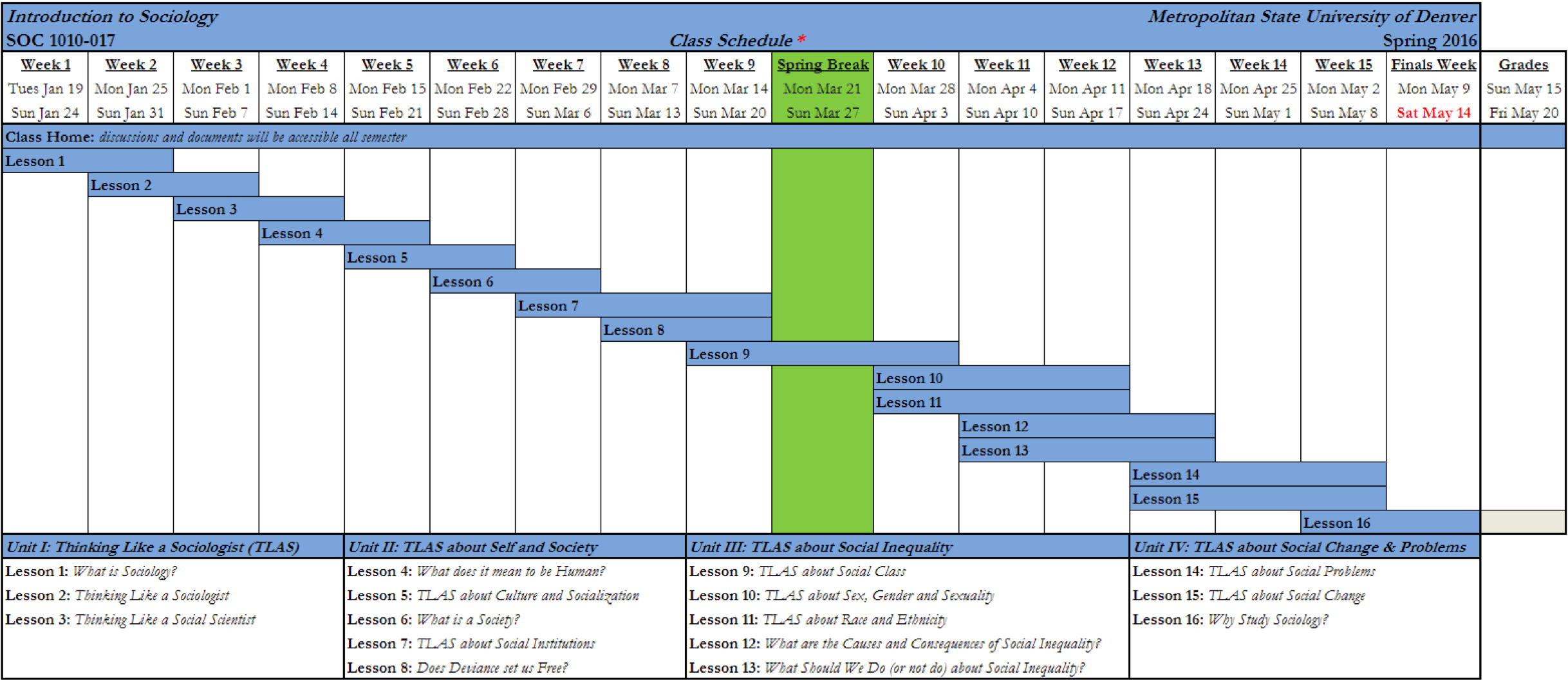
Nilson encourages ambitious instructors use a “graphic metaphor” as an over-arching theme within the syllabus. For example, the metaphor could be a floor plan (each lesson is a room), an ecological system (lessons interact with each other and show their interdependency), an exploded mechanical description (such as the engineering example above), or a four-course dinner (beginning with an appetizer and ending with coffee and brandy). However, if the thought of revising your entire syllabus is daunting, start small by adding graphic elements to your existing syllabus, such as the class schedule from an online Introduction to Sociology class (below), and progressively add graphic elements over several semesters. Or, create a “course overview” that features the most pertinent information about the class (such as the Infographics course below), and also post a full, text-based syllabus online. Fortunately, there are many websites and software programs available to assist you in your efforts (see resources below).

Click to enlarge
Finally, it is suggested that the effort to create a graphic syllabus will benefit the instructor’s pedagogy, as well as, the students’ learning. Creating graphic syllabi can offer instructors an opportunity to rethink their courses in new and inventive ways, and many find the process liberating and creative. “In the end they all had fun – the kind of fun that accrues from a
creative activity that blends the mental with the emotional, freedom with structure, and play with work. This is the type of activity that injects new life into college teaching” (Nilson 2007 p.231).
Still thirsty? Take another SIP of Graphic Syllabi
Linda Nilson (2007) The Graphic Syllabus and the Outcomes Map: Communicating Your Course. Published by Wiley, and available at the Auraria Library
- https://books.google.com/books?id=Hwl_QOk4h0EC
- http://www.wiley.com/WileyCDA/WileyTitle/productCd-0470623543.html
- http://skyline.ucdenver.edu:80/record=b2156572
Additional resources
- A Graphic Syllabus Can Bring Clarity to Course Structure https://centerforfacultydevelopment.wordpress.com/2012/05/04/a-graphic-syllabus-can-bring-clarity-to-course-structure/
- Graphic Syllabus and Outcomes Map – New Additions to Your Fall Syllabus? http://blogs.agu.org/geoedtrek/2014/08/06/graphic-syllabus/
- Creative Approaches to the Syllabus http://chronicle.com/blogs/profhacker/creative-approaches-to-the-syllabus/35621
- Creating a Syllabus that Jumpstarts Learning http://www.designingforlearning.info/services/writing/ecoach/tips/tip94.html
- Course Wrapping with Concept Mapping — A Strategy for Capturing Course Content Meaningfully http://www.designingforlearning.info/services/writing/ecoach/tips/tip54.html
- Matejka & Kurke. (1994). Designing a Great Syllabus. College Teaching, 42(3), 115-117 http://www.jstor.org/stable/27558664
- Three examples of graphic syllabi http://www46.homepage.villanova.edu/john.immerwahr/TP101/Prep/Graphic_syls.pdf
You don’t have to be a graphic artist to create a graphic syllabus! Fortunately, there is software available to assist you with the arrangement information spatially and provides graphics such as colors, arrows, boxes, and images. A list of some of the infographic/concept map software available.