The spacing in-between letters is known as tracking and spacing in-between lines of text is known as leading. It is important to create enough space in-between lines of text that way, users with a sight or reading impairments can easily read the information. If the letters and words are too close or crowed, it will be hard for your users to read effectively.
Below are examples of approved spacing of point size of the font and leading pairing within a website and in written information.
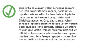
Accessible
Visual Example
This is a visual example of the correct use of spacing for headings and lines of text within a paragraph. The leading is at least two to three points higher than the font point size.
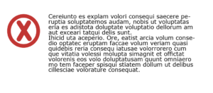
Inaccessible
Visual Example
This is a visual example of the incorrect use of spacing for headings ans lines of text within a paragraph. The lack of leading or the space between lines of text is too close.