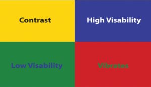
The WCAG Guidelines are the pre-eminent rulebook for accessibility design, especially when it comes to web and digitally-based media in the United States, which is currently ranked at AA (Double-A) status.
The WCAG is composed and continuously updated by a panel of high-level designers, programmers, ADA officials, and more, making it the top legal authority on the matter within the United States.
Canada and Europe have similar standards of AAA (Triple-A) status.

Accessibility Contrast
In the WCAG 2.1 Standard, the minimum contrast requirement for text and images
of text is 4.5:1.
Accessible contrast levels are determined
by contrast ratios, which will be detailed
in the next chapter.
The accessibility contrast standard was implemented for the benefit of individuals
with impaired eyesight, color blindness, and other visual processing disorders that affect the perception of color in relation to digital content.
Contrast Exceptions
The only exceptions to the 4.5:1 Contrast Guideline include the following:
- Large Text: 3:1 ratio required
- Incidentals: Text/Images of
Text that are part of an inactive user
interface component, purely decorative,
that are not visible, or are part of a picture
that contains significant visual content have
no contrast requirement. - Logotypes: Text that is part of
a logo or brand name has
no minimum contrast requirement.
The following link will direct to the WCAG Contrast webpage: