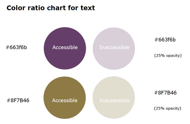
A basic rule with color contrasts is to remember to have at least 4.5:1 ratio between colors, according to Web Content Accessibility Guidelines (WCAG). This rule is most pertinent when using regular sized text, where as for larger text a rule of 3:1 ratio is successful .
There are different tools to reference when designing for
color accessibility, here are our favorite ones:
Colorable
Contrast Checker Online
Adobe Color Accessibility Tool
