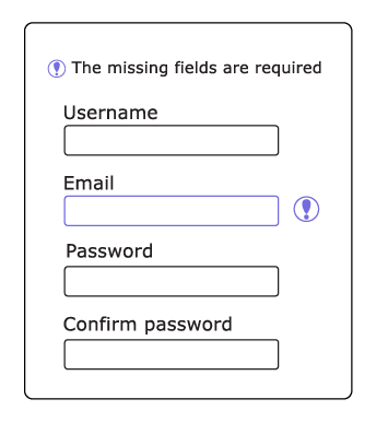
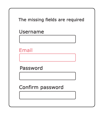
When designing for interactivity with a document or website, be sure to add icons that indicate where actions are needed. Doing so would prevent a percentage of your audience not getting confused with “highlighted” fields with colors they can’t distinguish.
Example of color indicators
Accessible:

Inaccessible:
