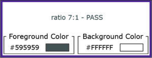
The contrast ratio of 7:1 for text and images of text was chosen for level AAA. This ratio compensates for the loss in contrast sensitivity usually experienced by users with vision loss equivalent to approximately 20/80 vision. Just like the contrast minimum, it has few exceptions: large text must have a contrast ratio of at least 4.5:1; incidental text does not have a contrast requirement. Note: images of text should be used for pure decoration or where a particular presentation of text is essential to the information being conveyed (ex: logotypes).
https://webaim.org/articles/contrast/
https://www.w3.org/TR/WCAG21/#identify-purpose
Example of good contrast for small text:

Example of image text that is a part of a logo:
