Accessible Fill-out Forms
Creating an accessible form can apply to many scenarios the most common use is the digital platform. best practice for designing forms require one to have labels for elements, using single column top-level label, using color and symbols for errors, creating sections and easy navigation.
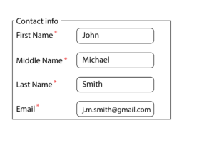
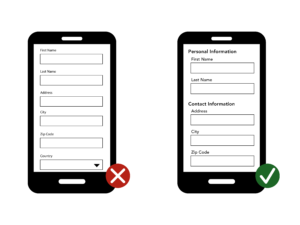
Layout – Sections and Labels
When creating a content/ fill-out form for web. One needs to consider the use of sections to compartmentalize information, it allows for easier reading and hierarchy. Using Labels on all elements allows the user to navigate through the form accurately while also allowing easier use of programs like screen readers and keyboard navigation.
User Experience – Identity, Operation, State
From the User side of the interaction, they must be able to consciously hit all three targets. First, they should be able to Identify what ‘it’ is. Secondly, how ‘it’ is operated by the user. Finally, what state ‘it’ is in at the moment of use. These will help establish if the form is clear for the audience in various scenarios.