When formatting information organize your layout using headings and subheadings. Screen readers move through by a reading order. Beginning with, Heading 1 to Heading 2 and so on. After there are no more headings the reading order will recognize paragraphs next, and the screen reader will let the viewer know they will listen to a paragraph. Breaking up information into smaller paragraphs will aid the viewer into finding information that are looking for faster, rather than listening to a long list or a long paragraph of information.
Headings H1, bold, 24pt+
Subheading H2-4, medium/bold, 18pt+
body copy, book/regular, 14pt+
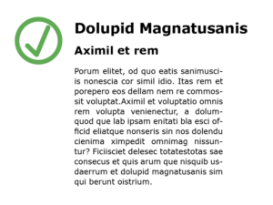
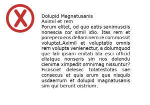
Below are visual examples of accessible and inaccessible use of headings, spacing, and font point size:
Accessible
Visual example
This is a visual example of the correct usage of heading point size paired with the correct usage of body copy point size.

Inaccessible
Visual example
This is a visual example of the incorrect usage of no heading point size from the body copy.
